How my obsession with fonts helped me nail a headshot.
Each client coming in for a headshot brings along a unique challenge. I need to get them to ease out in front of the camera and have them play along my game of headshots.
Once Neha’s headshot appointment was set, I sent along the headshot preparation guide. By the end of the day she assured me that she had it all sorted and had no questions about the preparations for her headshot session. Though she did mention again and again that she gets nervous in front of the camera and was worried about the session.
Come 11am the next morning; true to all our previous work appointments, Neha was at the studio bang on time. She had barely settled in when she looked at the light setup and said “Am I supposed to stand in front of all that?”
“Suddenly I was talking her language. The tensed shoulders and neck started to ease out and she finally began to have fun.”
When I have a client who is nervous and continuously worries about looking bad in front of the camera; it usually means I have to really juggle my thinking hats quickly. I knew that Neha, a design major with a Masters degree in Graphic Branding & Identity from London College of Communication, runs a successful design boutique called Studio 13 that caters bespoke invites and wedding cards.
I always shoot tethered into Capture One. It works very well for what I do and it gives me exceptional control on my workflow. Shooting tethered also helps me review the images immediately with the client on the screen. I compare the before and after and this helps them get a lot more confident on my skills. When my clients see the change in the images and see that they are looking better progressively they tend to get in the groove of the shoot.
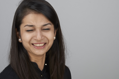
After the first few minutes of getting her to get in the correct position and stance I started talking about design in general. I explained to her why I was making her stand in a certain way and what it would do to the image that I was making. A little discussion on visual hierarchy went a long way. Suddenly I was talking her language. The tensed shoulders and neck started to ease out and she finally began to have fun.
Fonts have been an area of interest to me since design school. As a bespoke invitation designer this is something that Neha would work with every day. So I just went with the fonts that I knew she would never use. Jokerman, Papyrus, Comic Sans, Zapfino, Bleeding Cowboys and Curlz. For the non initiated, these are fonts that no good designer worth their font would use on invites. Most designers that I know of would usually drop the client if they insisted on using these fonts.
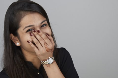
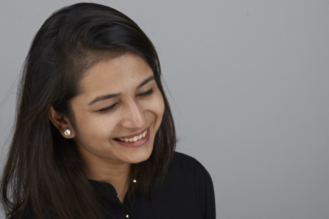
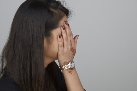
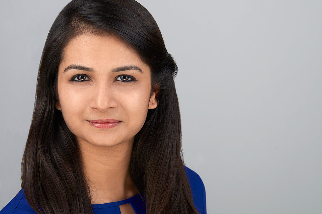
These individual words helped me break down that invisible wall and helped me reach through to her and put her to ease. Towards the end I asked her to change from her black top to a blue and the result was this final image!
Neha Jhunjhunwala